Objective: My mission? To sprinkle a little rainbow magic across St. Petersburg, Florida, with consistent branding that shines brighter than a disco ball on Pride month.
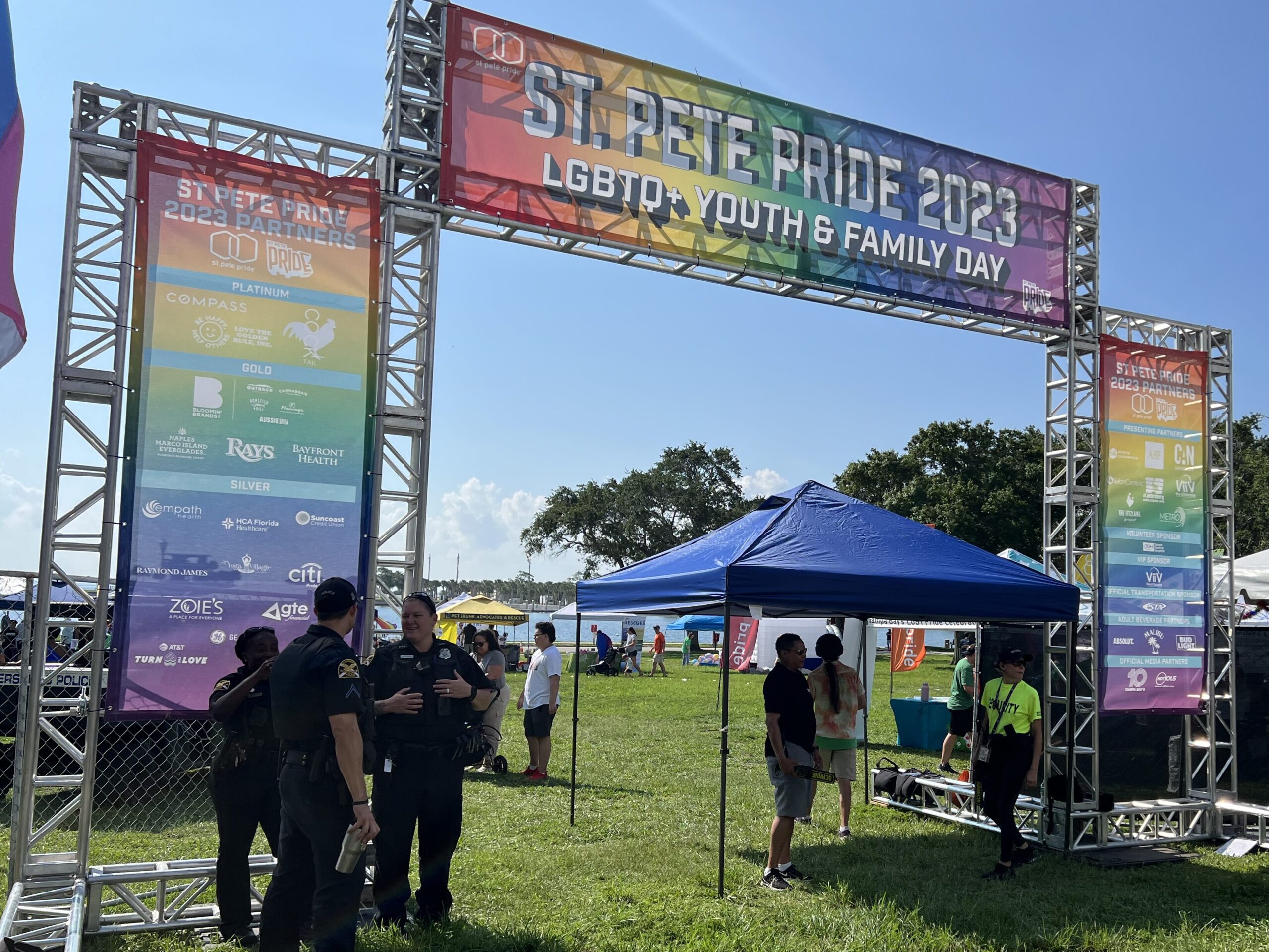
Enter St. Pete Pride, the nonprofit powerhouse serving up safe spaces and awareness for the LGBTQIA+ community. With over 300,000 fabulous patrons swarming in for the festivities, this is the big leagues, folks!
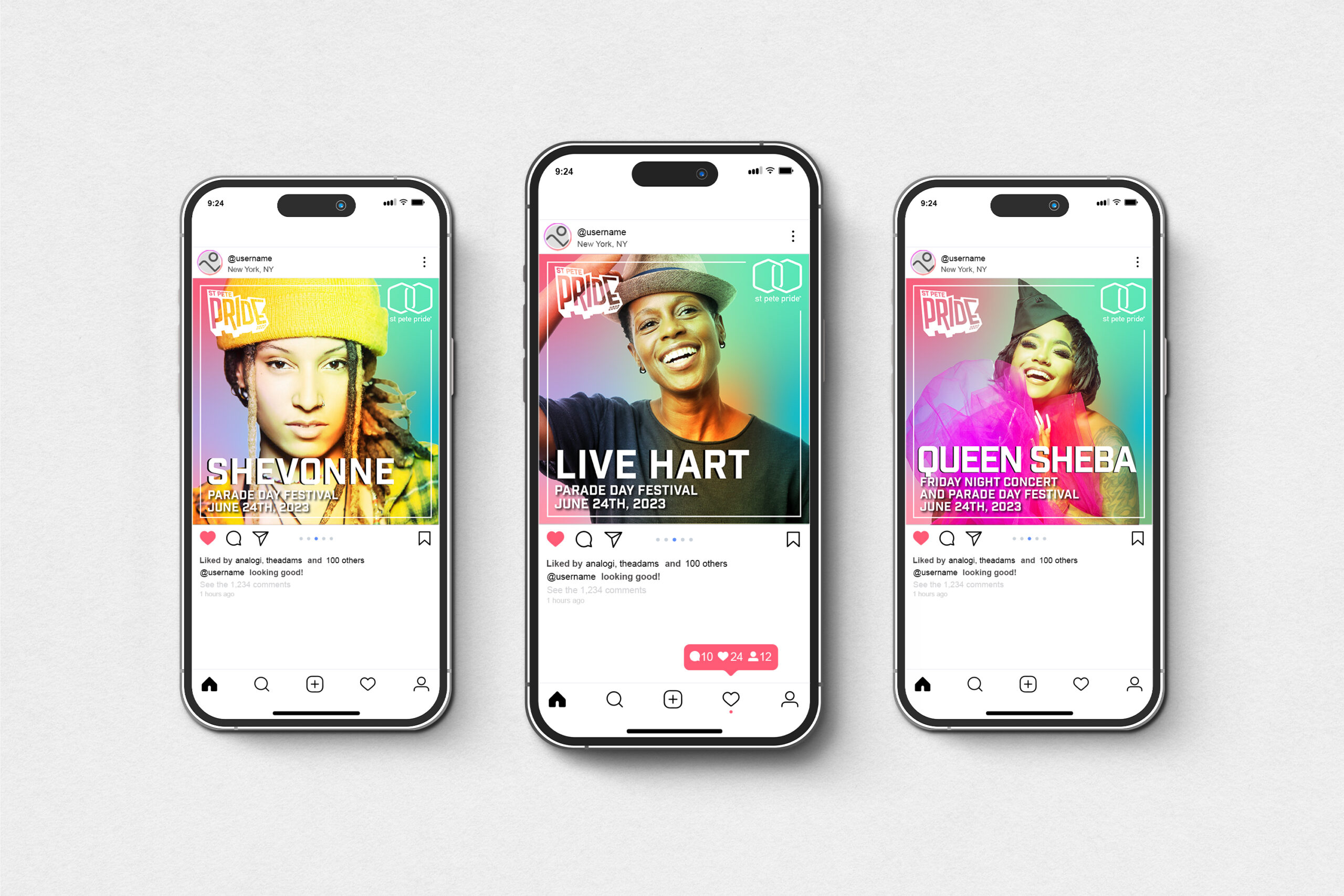
Now, picture this: every June, St. Pete Pride unveils a theme that sets the stage for a month-long celebration of love and acceptance. This year’s theme? Was inspired by Artists and Graffiti. Armed with existing brand assets and a whole sparkle, I set out to create informational signage that’s as clear and concise as a drag queen’s wit.
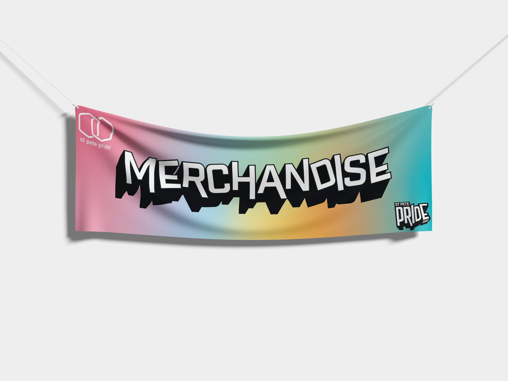
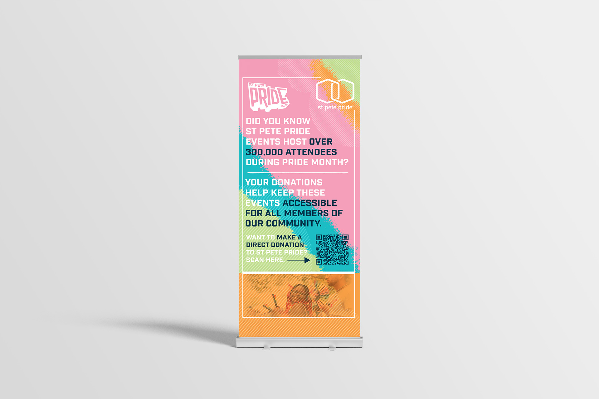
From parade banners to stage banners, archway banners to donation rollups, and everything in between, I was on it like glitter on glue. Each piece had to scream “Pride” louder than a chorus of divas, all while staying true to the theme.
But hey, it’s not all rainbows and unicorns. With over 35 deliverables on my plate, I had to channel my inner design guru to ensure every font was legible, every color scheme popped, and every message hit the mark.
And you know what? Mission accomplished! St. Pete Pride had a consistent theme that left no rainbow unturned and no patron uninformed. So, here’s to Pride month—may it be as bold, beautiful, and downright fabulous as the community it celebrates!